What’s Old is New Again (NHL Style)

According to WordPress’s new, more comprehensive statistics page the second-most popular post I have ever come up with—at least according to number of page views—is a post from last year on hockey jerseys (naturally, of course… What else would you expect, on a blog that deals primarily with faith-related subject matter?). Apparently I am not alone in my life-long fascination/curiosity with hockey jerseys! So, because fall is here and hockey season has officially begun, I thought a hockey post might be fun for a holiday Thanksgiving Monday (my apologies to the non-hockey aficionados who read this blog :)).
One of the things I have been delighted to see this year is the return of some of the classic NHL jerseys that had been absent during the 1990’s and 2000’s. During a dark decade and a half (at least for NHL uniforms) characterized by a mad haste to make hockey more palatable to our neighbours south of the border, classic hockey tradition was jettisoned and an astonishing number of truly ridiculous jerseys were adopted (two words: “wild wing”—let the hockey-wise reader understand). Virtually all teams were afflicted by this Gary Bettman-induced plague (a few notable absences were the Detroit Red Wings, Chicago Blackhawks, and Montreal Canadiens—although even these storied franchises dabbled in the 3rd jersey madness). The stupidity and ugliness was painful to behold for true hockey fans everywhere.
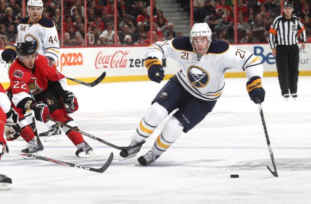
But over the last few years, sanity has been gradually returning. Slowly but surely, teams are returning to more classical looks from their past—a trend to which I can only say “more please!” Of course, there are always the Nashvilles, Floridas, Anaheims, Tampa Bays, and Carolinas of the hockey world (although not for long, it is to be hoped!), but as these images from the first few days of the NHL season show, there are still those out there who have some clue of how a hockey jersey should look!
 The Buffalo Sabres have finally realized that they got it right the first time! No more crazy-looking buffalo head, no more weird black, red, and silver uniforms—just the classic blue and yellow! Fantastic!
 As painful as it is for me to admit as a Flames fan, the Edmonton Oilers looked good pasting us 4-0 last Thursday night. These are the uniforms the Oilers wore in their heyday when Gretzky, Messier & co. were winning all their Stanley Cups (and usually going through the Flames to do so!). Sooo much better than those wretched practice-jersey looking uniforms they’ve been wearing for the last few years.
 The New York Islanders have to take the prize as the team that has most stubbornly and stupidly insisted on changing their jerseys over the years—often in spectacularly ridiculous ways (Captain Highliner, anyone?). When one considers how good their classic orange and blue unies look, it seems even sillier! Love the wide stripes, love the logo, love the colour combination. To whoever makes the uniform decisions on Long Island, only three words are necessary: LEAVE THEM ALONE!
 Love the simplicity of these vintage Philadelphia Flyers uniforms! One of the best things about the Flyers jerseys these days is the rectangular black name patch on the back—reminds me of my minor hockey days!

The highlight of opening weekend as far as uniforms go had to be the Vancouver Canucks/Los Angeles Kings game on Saturday night. Both wore their uniforms from 40 years ago to commemorate the first game in Canucks history. Both look amazing! I never thought I’d see the purple and gold on the ice again! If you look closely, you can even see Jonathan Quick’s super-cool vintage-looking goalie equipment that he adopted just for this game.

And last, but of course not least, my beloved Calgary Flames brought back the retros for a win against the LA Kings last night. I am not expecting great things from the boys in red this year, but hey—at least they will look good as they stumble to a 10th place finish!
Great stuff all around. Hope to see more in the future!
All images courtesy of nhl.com.
Discover more from Rumblings
Subscribe to get the latest posts sent to your email.
Well, Mr. Nostalgia – i really did get swept up in your rhetoric for a few brief moments. I started thinking about all those late 80’s early 90’s rink songs that seared into my brain at the time. Too bad some hapless team couldn’t sport the regal “W” of your old espoused. Those were the days…
.. when we thought Gretzky was gay and being gay was not cool. When the quiet reverence we reserved for Billy Smith and Ron Hextall would clamor for any slight evidence on the late night highlight reels.
those were the days when the real highlights in the sport were likely never recorded or shown on any television. Those were the days before lights, and wheels and coffee grinder – I chewed up my coffee beans before I brewed my coffee back then…
…ah yes those were the days my dad used to make us get up 3 hours before we went to bed so that we could do chores. Not only did they look better on the ice back then – darn it – they played better hockey too. Dave Cementhead was a superhero.
I’m crying now – are you happy!?! See what you’ve done?!? Gosh!
How am i supposed to get to sleep tonight huh?!
hahahahaha loved the reply
Yes, Dale, I am happy now. Not because you’re crying, mind you… Simply because you are one funny man!
10th? That is a little to high of a prediction for the flames 😉 and I do realize you mean in the conference 😀
What can I say? I’m an optimist :).
I’m afraid I don’t follow hockey or the changes of attire. But does faithfully watching “Battle of the Blades” count in your world? 🙂
My “hockey jersey world” has no room for “Battle of the Blades,” I’m afraid :). Although to be fair, I’ve never even watched the show…
Ryan, a little dissapointed that there is no mention of the Maple Leafs…
Travis, Ryan used words like “Delighted”, “Fantastic”, “Looked Good”, “Amazing” and “Super Cool” in the article. This language seems incompatible with a discussion of the Toronto Maple Leafs.